
Local SEO

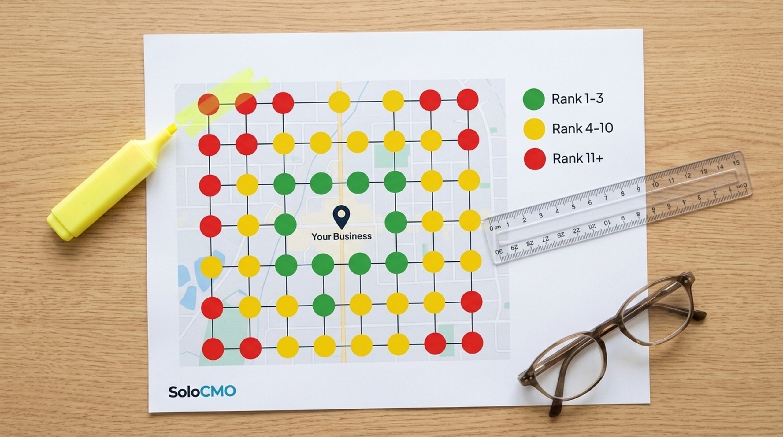
If you’re staring at a city grid full of red, yellow, and green dots and feeling a little lost, take a breath: that confusion is normal, and it clears up fast once someone walks you through it. Learning how to read a local seo heatmap for your business’s performance takes minutes, not weeks, and you don’t need an agency to do it. A local heatmap shows your Google Business Profile rankings on a map in a grid point by location. Color visually highlights where you rank well and where you rank poorly for a chosen keyword.
Reading one for the first time comes down to this: color shows where you stand, pattern shows why. Fixing what the maps ranking reveals is usually part of a bigger local SEO strategy. By the end of this article, you’ll look at any heatmap, name the pattern, and know what to fix first.
Key Takeaways
- Green grid points mean top 3 rankings, yellow means mid-pack visibility, and red means you’re buried or missing from local search results entirely.
- ARP measures your average position across every point on the grid. ATRP measures how deep you rank as a percentage. Read together, they tell a fuller story than either one alone.
- A strong center with weak edges usually points to a proximity issue, not a content problem. It doesn’t mean your GBP is broken.
- Patterns matter more than any single red dot. Chasing individual points wastes time a solo marketer doesn’t have.
- Most businesses should re-run a heatmap monthly to confirm local SEO changes are actually moving the needle.

What Is a Local Heatmap?
A heatmap for local SEO is built on geo-grid tracking. This method checks your Google Maps rankings from dozens of simulated searcher locations spread around your business. It’s not a single “where do I rank” question, it’s dozens of them at once. Tools like SoloCMO, Local Falcon, BrightLocal, Whitespark, and Moz Local all build this kind of report. Each one plots your search rankings across a set area so you can see coverage instead of one data point.
Geo-Grid Tracking vs. a Single Rank Check
A standard rank check tells you your position from one spot, usually your own office or home address. That’s misleading. It hides how fast your visibility drops off a few miles away. A geo-grid scan checks the Maps 3-pack results at each point on the grid instead. It doesn’t check organic web rankings, which makes it a Maps-specific tool, not a general SEO one. Ever felt confident about your local ranking after one search, only to have a customer say they couldn’t find you? This is usually why.
Why Local Search Visibility Varies by Location
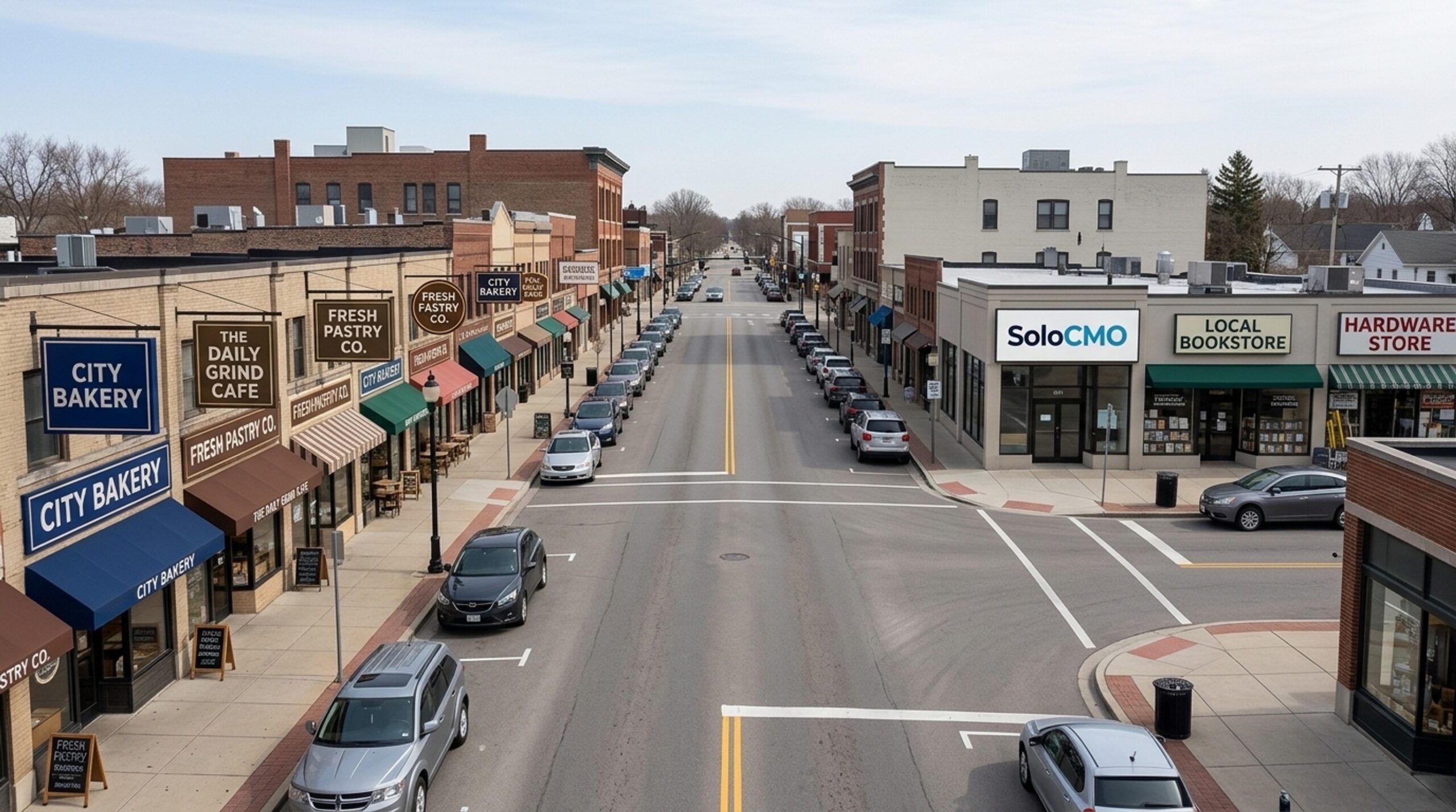
Local search results depend heavily on where the search happens. Google weighs the searcher’s distance from your business heavily. A rank tracker built on a single point can’t capture that. A heatmap shows your Google Maps rankings the way an actual customer sees them: differently, depending on where they’re standing.
Anatomy of a Heatmap: Grid Points, Colors, and Radius
Every heatmap is built from a few visual pieces. Once you can name them, the report stops feeling like noise. If something still looks off once you know the pieces, that’s usually a sign worth a second look rather than something to ignore.
Geo Grid Points and Pins
Each dot or pin on the map stands for one simulated search from that exact spot. The color of that pin shows your Maps rank at that specific location, nowhere else. A pin two miles from your storefront and a pin ten miles away are two separate results, not an average of each other.
Radius and Spacing
The distance between pins, and the total area they cover, changes the story the map tells. Pins spaced tightly across a small radius show fine detail in a small zone. Pins spread across a wide radius show how far your visibility actually reaches before it fades. Get the radius wrong and a business can look stronger, or weaker, than it really is. Always check what radius the scan used before drawing conclusions.
Grid Scans Center Point: Business Location vs. Searcher Location
This is the part that trips up most beginners. The center pin usually stands for your Google Business Profile location, not a searcher. Every other point on the grid represents a simulated searcher at that spot. Most tools center the grid on your GBP pin by default, though some let you move that center point, which helps a service-area business without a public storefront.

What Do the Colors on a Local SEO Heatmap Mean?
Color is the fastest way to read a heatmap. But the numbers behind the color matter more than the color itself.
| Color | Rank Range | What It Means |
|---|---|---|
| Dark green | Positions 1-3 | Business is ranking well, appearing in the Maps 3-pack |
| Light green / yellow | Positions 4-7 | Visible on page one but outside the 3-pack |
| Amber / orange | Positions 8-15 | Buried, unlikely to be seen without scrolling |
| Red / dark red | 16-20+ or not found | Missing from practical search results at that location |
The Standard Color Bands
Green means you’re sitting in the exact spot most likely to get a click or a phone call, since the 3-pack captures most local map interactions. Some tools use finer bands than the table above, splitting green and red into two or three shades each. Check your tool’s legend rather than assuming every heatmap uses the same thresholds.
What “Not Found” Really Means
A point marked “20+” or “not found” usually means your business didn’t show up anywhere on the first two pages of Maps results for that simulated search. That’s a real gap, not a scanning error, and worth noting separately from a merely weak yellow or orange result.
How Many Grid Points Should I Use for a Local SEO Heatmap?
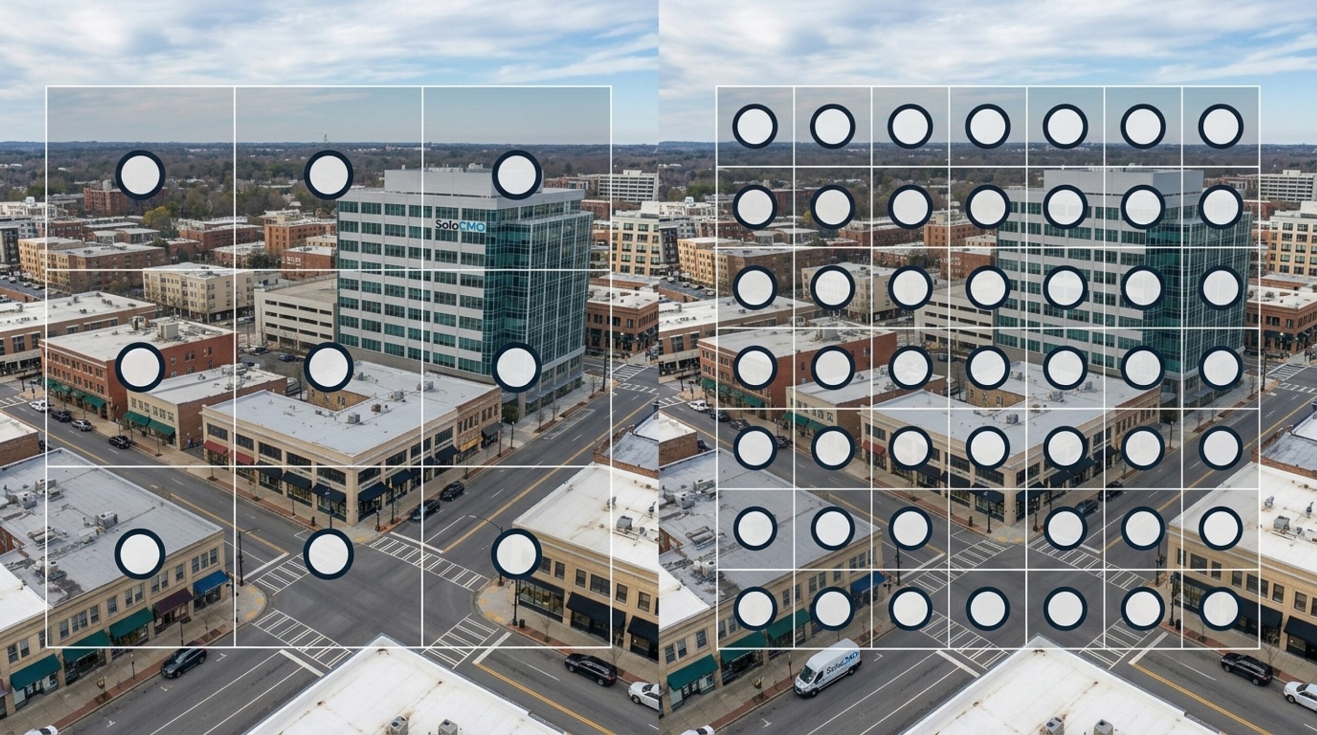
Grid size options usually range from a small 3×3 grid, made up of nine points, up to a dense 13×13 grid for high-competition markets.
Small Grids vs. Large Grids
Fewer points scan faster and cost less. But they miss detail. A larger grid shows precise coverage gaps across the areas around your business, and that matters more the more competitive your category is. A 3×3 grid is often enough for a first check. Ongoing tracking in a competitive area usually works better with 5×5 or 7×7 grids, since they spot patterns more reliably.
Matching Grid Size to Business Type
A business with a small service area or low competition can usually rely on a small grid. A multi-location brand, a crowded market, or a business trying to see its full city coverage should use a larger one. Getting this setting wrong is one of the quiet ways a heatmap can mislead people. A grid that’s too small or too large for your service area will skew every color you see.
Key Metrics to Know: ARP vs. ATRP
Once you understand color, two numbers turn the picture into something you can track over time.
Average Rank Position (ARP) Explained
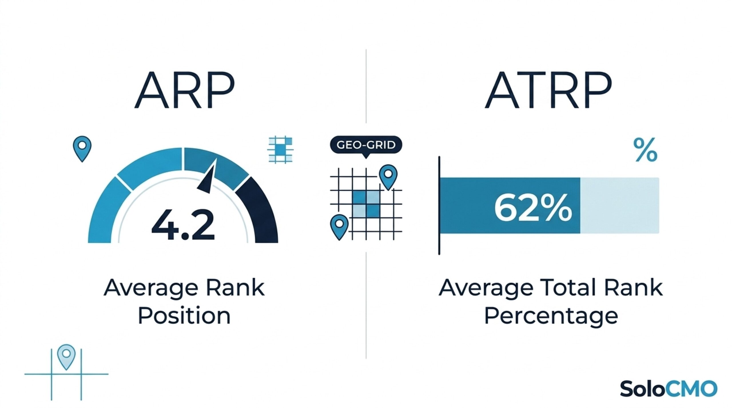
Average Rank Position is the average numeric position across every point on the grid. An ARP of 4.2 means that, on average, you rank just outside the 3-pack across the whole scan area. This is the number most people check first.
Average Total Rank Percentage (ATRP) Explained
Average Total Rank Percentage shows how deep into the results you rank on average, shown as a percentage. It’s especially useful when comparing two scans that used different grid sizes or keywords, since ATRP adjusts for that difference in a way ARP alone can’t.
Reading the Gap Between the Two
Here’s an example. A business with an ARP of 4.2 and an ATRP of 78 percent looks strong at first, since 4.2 sits close to the 3-pack. But that 78 percent figure shows more weak points scattered across the full map than the ARP number suggests on its own. Gaps like this usually mean a strong average position but uneven coverage, which is exactly the kind of insight that helps you judge performance honestly instead of relying on one flattering number.
Why Do I Rank Well in Some Areas but Not Others?
This is usually the moment a confusing map starts making sense.
Strong Center, Weak Edges: The Proximity Signature
If your green cluster sits tightly around your business and fades to yellow or red toward the map’s edge, that’s the classic proximity ranking factor at work. Google favors businesses that are physically closer to the searcher, so visibility naturally fades with distance. Proximity is one of Google’s three core local ranking factors, along with relevance and prominence. That’s why even a well-optimized GBP will still show some fade near the outer points of a large grid. This one’s worth remembering: fading edges aren’t a failure grade, they’re just physics.
Lopsided Coverage: Competitor Density
Green concentrated heavily on one side of the map, with red on the other, usually points to competitor density in that direction rather than a flaw in your own listing. More competitors nearby means more listings competing for the same searches.
Scattered Red: A GBP or Citation Problem
Red points with no clear pattern, scattered randomly across the grid, often point to a Google Business Profile or citation problem instead of a distance issue.
All-Green: Time to Play Defense
Full green coverage across the grid means dominance. At that point, the smart move is to shift from offense to defense. Expand into nearby keywords or regions rather than continuing to chase the same term.

What Is a Good Local SEO Heatmap Score?
There’s no single universal good score. What counts as strong depends on how many competitors are packed into your area and how crowded your category is.
| ARP Range | What It Signals | Typical Next Step |
|---|---|---|
| Under 3 | Strong visibility in most verticals | Shift focus to defense and expansion |
| 3-7 | Average and workable | Targeted fixes on weak zones |
| Above 10 | A real visibility problem | Full GBP and citation audit |
Benchmark Ranges by Competitiveness
High-competition urban areas and crowded categories like legal, home services, or dental usually need tighter grids and stronger scores to compete than low-competition niches. A business in a quiet category might see near-total green with little effort. A business in a crowded category might genuinely celebrate an ARP of 5 or 6.
Judging Your Score Against Your Own Trend
Compare your current scan to your last one more than you compare it to a fixed benchmark. Improvement over time matters more than any single snapshot. A bad-looking score can still show real progress if it’s better than it was three months ago. If you’re not sure whether your trend line counts as progress or just noise, that’s a reasonable thing to want a second opinion on.

From Reading to Action: What to Fix Based on Your Pattern
Once you’ve named your pattern, the fix is rarely a mystery.
- Strong center, weak edges: build proximity-based content and service-area pages targeting the underperforming regions.
- Lopsided coverage: run a competitive audit in the dense-competitor direction, then strengthen citation building to boost prominence.
- Scattered red: complete a Google Business Profile optimization audit covering categories, attributes, and photos, plus a citation consistency check through SoloCMO, BrightLocal, Whitespark, or Moz Local.
- All-green: focus on review velocity and expand into nearby keywords or service areas to defend your visibility heatmap and keep growing it.
A regional home services company we worked with ran a first heatmap and found a textbook lopsided pattern: strong green on one side of town, solid red on the other. Instead of rebuilding their whole GBP, they focused citation building and a handful of service-area pages toward the weak side. Within two scan cycles, the red zone had shifted to yellow. None of these fixes require guesswork once you spot the pattern. The map itself points to the right lever to pull. The harder part is finding hours in the week to pull all four levers at once, which is where most solo marketers get stuck. If that’s where you are right now, you’re not missing something obvious, you’re just out of hours in the day.
Conclusion
You can now do the thing that felt impossible a few minutes ago: look at your own heatmap, name the pattern, read the score, and point to the likely cause. That’s real, usable knowledge. But knowing what’s broken and having the hours to fix it are two different problems, especially when GBP optimization, citation building, review outreach, and proximity-based content are all competing for the same afternoon. If you want a second, professional read on what your heatmap is telling you and a clear plan for tackling it, get an estimate and let’s turn your diagnosis into a plan you can actually execute. No pressure either way, sometimes it just helps to talk it through with someone who reads these maps daily.
FAQ
What is a good local SEO heatmap score?
A good score depends on how competitive your category and area are, not on a fixed number. An ARP under 3 is strong in most verticals, 3 to 7 is average and workable, and anything above 10 usually signals a real visibility problem worth addressing.
What do the colors on a local SEO heatmap mean?
Colors show your ranking position at each simulated search location. Green means top 3, yellow means mid-pack, and red means poor or absent. Legends vary slightly by tool, so it’s worth checking your specific report before assuming a shade matches another platform’s scale.
What is the difference between ARP and ATRP in local SEO?
ARP measures your average numeric rank position across the grid. ATRP measures how deep you rank as a percentage. Comparing the two accurately over time works best with consistent scan settings, since changing grid size between scans can throw off the comparison.
How many grid points should I use for a local SEO heatmap?
A 3×3 grid works well for a first look, while a larger grid such as 5×5 or 7×7 suits ongoing competitive tracking. Choosing the wrong grid size for your service area is one of the most common ways a heatmap gets misread.
Why do I rank well in some areas but not others on my heatmap?
Proximity and competitor density are the two most common causes of uneven local rank results. The right fix depends on which cause you’re actually dealing with, since a proximity issue and a competitor-density issue call for different next steps.
How often should I run a local SEO heatmap report?
Most businesses should run grid scans monthly to confirm whether local SEO changes are actually working. Any major GBP update, new location, or campaign launch is a good reason to run a fresh scan sooner rather than waiting for the regular cycle.
What is the difference between a heatmap and a single-keyword rank check?
A single rank check shows your position from one point, usually your own address. A heatmap shows coverage across an entire geo grid. Treating a single check as your full local ranking picture is a common and costly mistake.
Do I need to fix every red grid point on my heatmap?
No, prioritizing by pattern works better than chasing individual red points one by one. Grouping red zones into a proximity, competitor, or GBP issue lets you fix the root cause instead of spending limited time on symptoms. And if you’d rather have someone else group them for you, that’s exactly the kind of question our team is happy to answer, get an estimate whenever you’re ready.
Recent Posts

Why Is My Funnel Converting Below Industry Average?
A below-average funnel conversion rate almost always comes from one of five causes: mismatched traffic, a weak landing page or offer, poor follow-up, weak lead qualification, or the wrong benchmark. You don’t need a week of guessing to find the cause. A structured funnel diagnostic can find it in hours. If you’d rather hand the work off, that’s exactly what
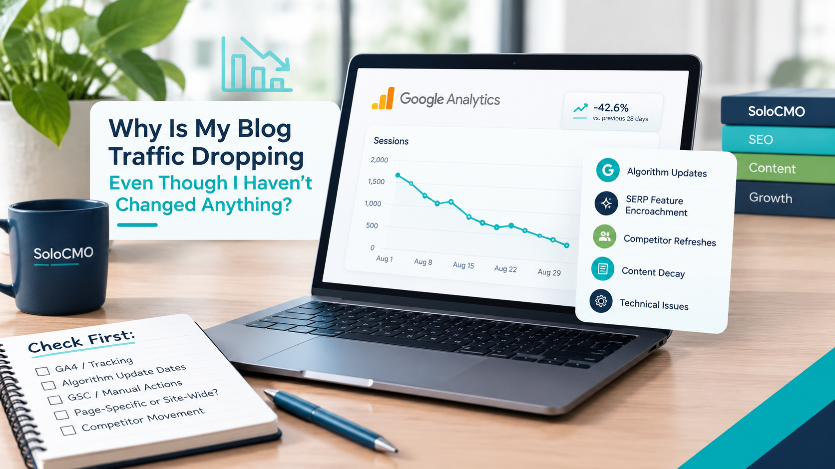
Why Is My Blog Traffic Dropping Even Though I Haven’t Changed Anything?
If you’re staring at a declining line in Google Analytics and mentally replaying every recent action looking for what you broke, stop. Blog traffic dropping for no reason is one of the most confusing problems a solo marketer can face. Here’s the short answer: it’s almost never something you did. Traffic drops without site changes are usually caused by algorithm
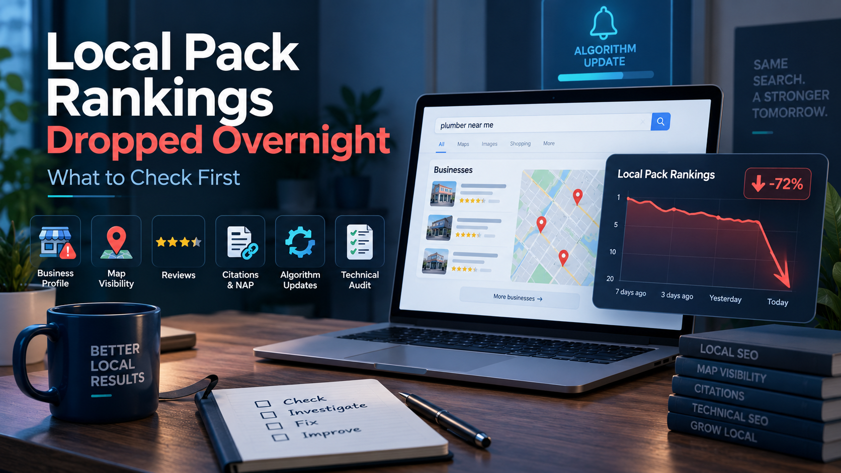
Local Pack Rankings Dropped Overnight: What to Check First
Okay, first thing: check your Google Business Profile status. When local pack rankings drop overnight, that’s the fastest and most common cause, and confirming it takes under two minutes. This isn’t a mystery that needs an agency or a week of guessing. It’s a known, ordered checklist, and you can run it yourself in the next hour. If your GBP
Get Smarter About Your Marketing
Practical SEO, AI, content, and marketing strategies you can put to work immediately.
Join the Newsletter